
END OR ET
From the Book CENTAUR LETTERS (part two)
author: Rastko Ćirić
| ROMEO |  |
JULIJA |
| Probably the most beautiful letter sign, a supreme challenge for those designing letters, is &, also a ligature. | ||
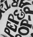
It was made from the Latin »et«, meaning »and«, and it kept that meaning until today, most commonly in the company titles composed of several names, such as SAATCHI & SAATCHI or MATTHEW & SON, in newspaper titles or on posters.
 |
 |
|
 |
 |
|
 |
 |
 |
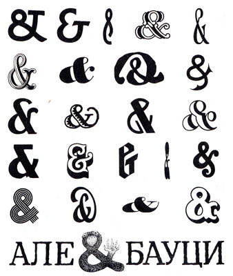
| Nowadays character ET is obligatory part of any letter type and depending upon the designer’s imagination it may appear in considerably diversified and imaginative shapes. They can be particularly rich in titles. Besides they can often be a decoration. See how diversified this sign can be. |
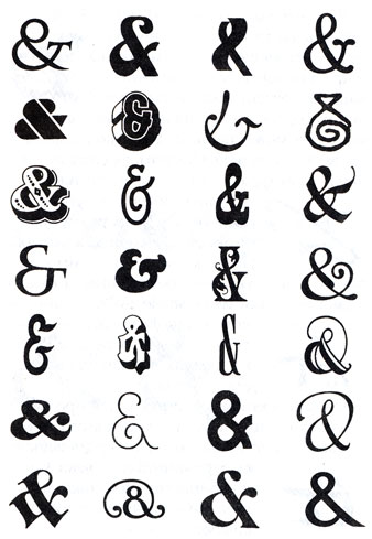
In English this character is called AMPERSAND, and that name was given to it by children in the 19th century. As it was placed at the end of an alphabet that children learned in schools: …X, Y, Z, &, the pupils had to learn by heart: “X, Y, Z, and per se and” (”per se“ in Latin means “by itself”, therefore: X, Y, Z and the sign that means “and” by itself). Repeating that phrase many times, children made it into “ampersand”.
The first example of “ampersand” can be traced on a Roman papyrus from the year 45 A.D. It was written in Roman Italic, common in that time.
The wall inscription from Pompeii , from the year 79, shows a ligature made out of the letters E and T, a bit less legible from today's point of view.

Later calligraphic manuscripts elongate the middle line of letter “e” connecting it with the upper line of the letter t. “ET” shown in the picture is taken from a Scottish manuscript from the 9th century. Here this combination of letters already begins to look like uniform symbol.

Since the end of the 8th century, ligatures became a common thing. “ET” shown in the picture is written in the so called Caroline Minuscule, from the year 810. One of today's standard shapes is appearing.

Quite often, for the purpose of shortening, the sign “et” was put in the middle of the word even: the picture presents rebus-word “etceteris” from the 9th century.

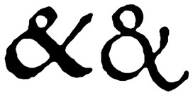
During the Renaissance, the Humanistic Minuscule proclaims the standard & shape, which has been adopted and established by the appearance of printing. The picture contains two handwritten examples from the Renaissance Italy, the first one from 1453 (the year of the Byzantium Empire fall), and the other from the year 1500.
The printed example is from the year 1706; the shape of the letter remained the same since the 16th century. The letter type is Renaissance Antique.
There are interesting examples of variations of the still unaccepted shape of the ET ligature. Here are three unusual shapes designed by the Renaissance type expert Ludovico delli Arrigi in 1522.
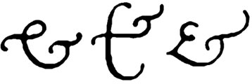
Two typographic examples from 1728 (French typographer Robert Granjon) and from the 18th century (Englishman William Caslon) show the variant where the letters ET are much more visible than in Renaissance Antique.
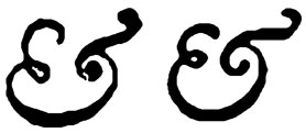
In the 19th century, by appearing the letter types without serifs, type designers chose the other version of the ET character, but they made it skewed it the italic variant.
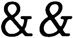
Glifa roman i glifa italik
Poetica is the name of a letter type designed by Robert Slimbach, inspired by Renaissance Cancellaresca. We mention it as it contains even 58 different variants of the ligature ET, from which we reproduce only six.
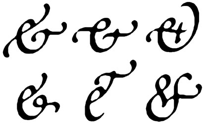
Two basic shapes of the ligature ET will remain the most common till nowadays: the first one is mostly used in the “upright” typefaces (Roman), and the other one in the skewed ones (oblique or italic).

WHAT ARE LIGATURES?
CENTAUR LETTERS (part one)
THE MONKEY STRUDEL
CENTAUR LETTERS (part three)
MONOGRAMS AND MARKS
CENTAUR LETTERS (part four)