WHAT ARE LIGATURES?
From the Book CENTAUR LETTERS (part one)
author: Rastko Ćirić
LIGATURES are two or three letters joined into one letter character.
For example that is A, as in the Latin word
ENCYCLOPÆDIA.
Even old Egyptians looked for methods to simplify and shorten the common combinations of symbols by joining them into ligatures.

The picture shows the crowns of Upper and Lower Egypt representing the two kingdoms. The crowns combined represent the united Egypt.
In the Chinese pictorial alphabet, every character represents at least one word. With combination of two characters a new meaning is born.
 |
||||
claws |
+ |
tree |
= |
pick |
In ancient Rome , stone carvers and scribes as well, put together different letters, for easier equalization of the width of letter rows on a stone block.
 |
 |
 |
The Middle Ages' scribes liked to join letters to save the space and increase the speed of writing, but the nice look was equally important – the space between letters should have been as uniformed as possible, but often some letters literary “collided”. For example, dot on the Latin letter »i« was always in the way to the upper part of the letter »f« when it was positioned behind it, so a scribe was forced to join them.
 |
 |
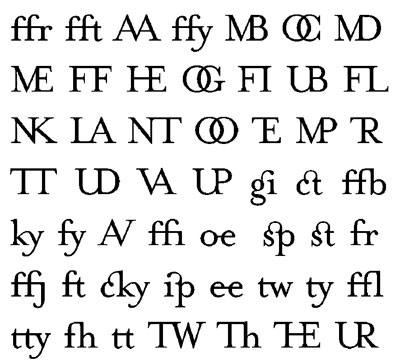
Thus, the horizontal slash of the letter »f« would quickly break down, forming the column of the letter »i«, and the upper part ended with a dot. The most common ligatures were: , ff, , ff (old long »s«, therefore »ss«), ft (st), ct, ch, æ,œ and the three-lettered ffi, or ffl.

There are four basic sorts of ligatures: when one letter is connected and tied with another one (litterae implexae), when one letter is above the other (litterae columnatae), when a letter is put inside the other (litterae insertae), and when letters are connected by one common stroke (litterae contiguae).
Serbian Middle Ages scribes liked to join letters so much, that often all the letters in a word were connected together. Here is a joined AMEN taken from the inscription from the King's Church in Studenica monastery, dated 1314.
 |
 |
The picture on the right is a contemporary version of the same word-ligature, as a part of the computer font »Milutin's Inscription« by Stjepan Fileki.
The early printers in their use of wooden, and later lead printing letters, adopted ligatures, especially with cursive (oblique) typefaces

because it was impossible to put the letters closer one to another in order to make the space between them smaller. Besides, such ligature letters were harder to break.


The picture presents ligatures from the first printed book, Guttenberg's Bible from 1444, presenting the unusual ligature «pp» in the word Appolon. This letter type, as it reminds on a lattice, is called Textura.

Here are old Slavs ligature letters ЈА,ЈЕ and ЈУ from the first Serbian printed book »Octoih«. It was printed in Cetinje in 1493, only fifty years after the Guttenberg's Bible. A horizontal line connected the letters A, E and O with the Cyrillic letter I that resembles the contemporary Latin letter I. The character ”yu” still exists in the Russian alphabet. Serbs today have in their common use the ligatures Љ, Њ. Those letters, as Vuk Karadzic (reformer of the Serbian alphabet in the 19th century) explains in the first “Serbian Primer”, were created by joining the Cyrillic letter л, that is н, with old Slav letter ь.

Н + Ь = Њ Л + Ь = Љ
However, these two letters appeared as ligatures in old Serbian manuscripts: ligature »Љ« at the end of the signature of King Stefan on his Dubrovnik Community Charter from 1235, and ligature »Њ« at the title of the Code of Vladislav Gramatic from 1469.
 |
 |
Today, ligatures are not common in books and newspapers as they used to be: yet, I am sure that hardly one percent of readers would even notice them in a text (did you notice that letters »i« and »g« in the word “notice” are tied?). However, all the standard Latin computer fonts do contain ligatures æ and œ,and commonly and .

Use of ligatures in a contemporary printed text is considered as a typographic delicacy: they are used by experienced typographers, and are aimed at experienced reader or bibliophile. Some of modern alphabets, like the Lubalin's Avantgarde, have specially designed ligatures giving it characteristic look, especially when used in titles.

Here are two interesting gg ligatures.

In dictionaries, the ligature æ is used in a phonetic alphabet to show that the voice has to be pronounced somewhere between voices a and e.

t is not common knowledge that the question mark and the exclamation mark are in fact ligatures. In old Latin manuscripts, in order to point out that the sentence was interrogative, the word “questio” was added at the end of it. As that word occupied the precious place on a costly parchment, scribes afterwards shortened that word into “qo”, but such an abbreviation confused the readers, as it was connected with the last word in a text.
 |
 |
 |
Some smart scribe got an idea, and put one letter over another. In time, due to the need to write quickly and re-write, the letter o became a dot, and the letter q was transformed into a curved line forming today's question mark. Did you understand, questio.
Similar thing happened with the exclamation mark. In old Latin the word for exclaiming was IO, meaning AUCH. As with the question mark, the letter ”I“ climbed over the letter “O” and gradually the exclamation mark was formed. Therefore, it comes that a word AUCH with an exclamation mark is a pleonasm! AUCH!
Ligature “ß” is in use in German language. It is called “sharfes es” (sharp s) or “escet”. The term “escet” (sz) is wrong, for this ligature was not formed out of the combination of the old “long s” and “z”, as it looked like in the Fractura, the late gothic letter type, but of the “long s” and normal “s”. In Switzerland , instead of this ligature the two s are written (ss).

In the mid nineties (of the twentieth century) computer program LIGATURE MAKER appeared on the market. It allows the user to make a chosen ligatures in any text, but using the given letter type. The ligatures were created by American designer Zuzanna Licko.

The sign for section (§), although it seems that is made by joining two Latin letter “s”, is not a ligature, but comes from a deformed Greek character.

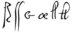
Ligatures from computer typeface »Leonardo hand«,
created from Leonardo’s handwriting
END OR ET
CENTAUR LETTERS (part two)
THE MONKEY STRUDEL
CENTAUR LETTERS (part three)
MONOGRAMS AND MARKS
CENTAUR LETTERS (part four)