CYRILLIC WORKSHOP IN SPLIT
The Art Academy in Split
1 – 5 March 2016
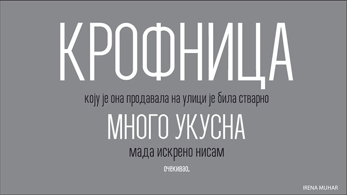
authors: Anja Jovanovic and Irena Muhar
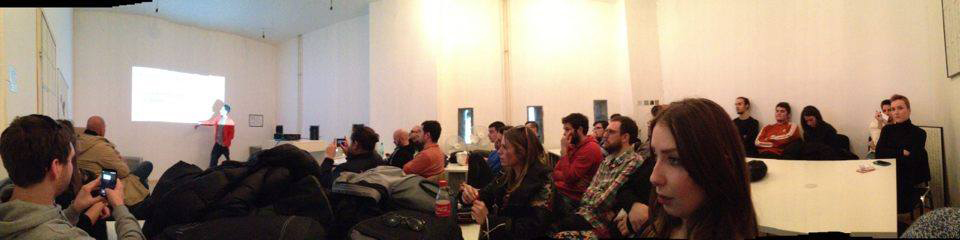
In early March, at the invitation of Niкola Đurek, a professor of the Art Academy in Split, as the fourth year students of the Faculty of Applied Arts in Belgrade,we got the opportunity to travel to Split, where we participated in a Cyrillic workshop. The goal of the workshop was to teach young typeface designers from the former Yugoslavia how exactly Cyrillic letters should look like and how to properly plant of Cyrillic letters to a Latin font. We had an advantage over the other participants because we are familiar with the Cyrillic script, which is our native script, and we have already designed the Cyrillic glyphs for the Serbian language in fonts that we started in the first semester
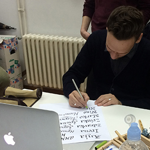
The first day began with a presentation of the work of the moderator Ilya Ruderman in the field of typography and typeface design. What is interesting is that Ilya deals with the creation of the Cyrillic alphabet for already existing Latin fonts, and he participated in many important projects in Russia. On the same day we’ve got familiar with the shapes of Cyrillic glyphs and experimented writing with different tools.
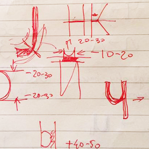
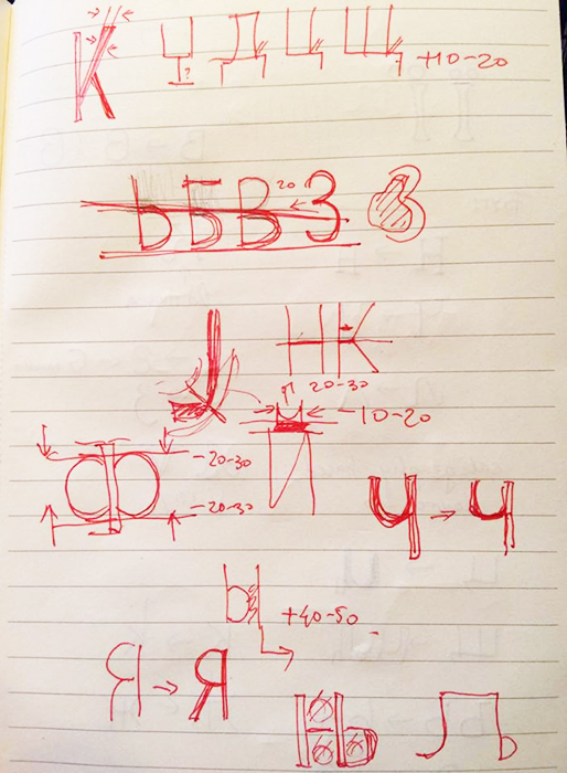
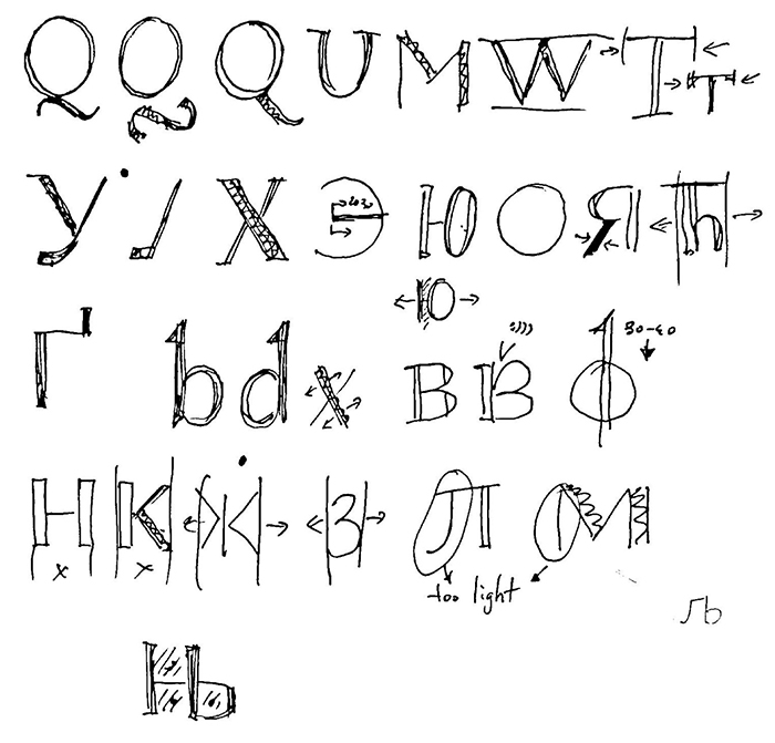
The following days were reserved for making the Cyrillic font from an existing Latin that we prepared before the workshop. We worked on upper and lower case and then sorting out the results. Unfortunately, we did not have enough time to deal with the spacing, kerning as well as some complex functions in creating fonts, but we did get a very detailed analysis of letterforms.
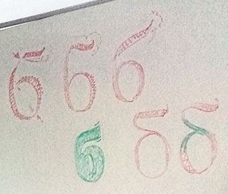
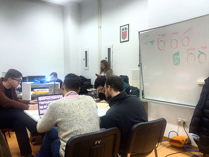
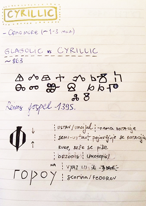
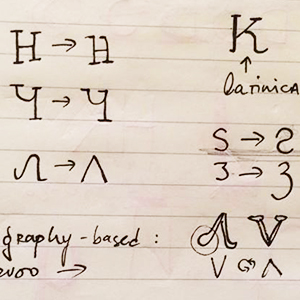
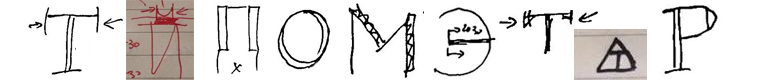
Since Ilya came from Russia, he was primarily focused on the Russian Cyrillic alphabet, which in some parts differs from ours – so we later discussed the Serbian and Bulgarian alternatives. In the Bulgarian Cyrillic alphabet letterforms tends to be similar to Latin. For example, the glyphs Л and Д have basically triangular body, essentially using the form of letter A, unlike Serbian which basis is shape of П. More, it was interesting that they rarely use the same form for the letter K in Cyrillic and Latin version – usually the appearance of the glyphs differs.
In addition to practical work during the workshop we had theoretical lectures also. One lecture was on the history of the Cyrillic alphabet, how it started, where and when the first printed work appeared. The greatest attention has been put on the reforms of Peter the Great and his influence that has contributed to the present form of Cyrillic. Peter the Great traveled much through Europe. He was fascinated by the printing industry and ordered Cyrillic fonts to be casted. In addition, he changed letterforms themselves. He has invested a lot of effort into the letter design, and there are documents showing how he introduces letters modeled similar to Latin antiqua, and even completely removes some Cyrillic letters used at that time.
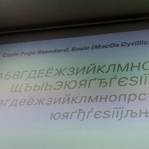
The second presentation was Terrible Cyrillic where we discussed the computer system fonts with poorly designed Cyrillic. In this segment, we reviewed many fonts in everyday use – Myriad, Times, Times New Roman, Baskerville, Arial, Helvetica, and many others. Through detailed analysis, we tried to spot poorly designed forms and details of individual glyphs and finally concluded that among all the system fonts, Georgia has the best harmonized Cyrillic and Latin alphabet. For example, one of the fonts often used with us – Times – is showing a pretty bad Cyrillic alphabet – the letter Д is not wide enough, the letters K and Ж are not made in the same style, the slope of the left stroke of the letter Л is too sharp, and more.
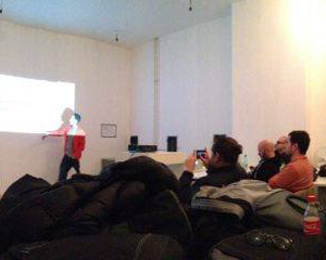
On the last day we had a joint presentation where we displayed the work of the workshop participants to the professors of the Academy. In less than 4 days, the group was able to create a Cyrillic font, and the whole experience was very interesting for their students, as well for us, and the results of the workshop were great. We learned a lot about the principles of font creating and shall certainly use the experience from this workshop in our further work in the field of typeface design.
More about the workshop:
https://www.behance.net
Useful links:
http://www.typonine.com/
http://dailytype.com/
http://typejournal.ru/en/