Words that illustrate Contextual Alternates
banana geese
inicials unusual
look out

banana geese
inicials unusual
look out
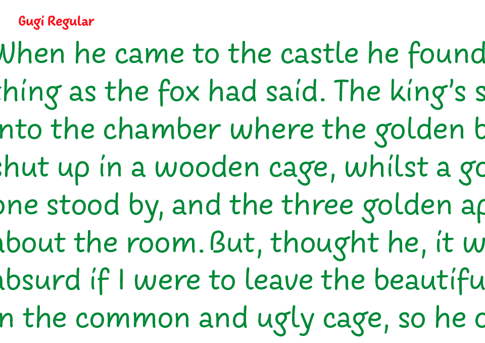
About the Gugi typeface
The Gugi typeface is a handwritten sanserif with a monolinear character, executed in upright and italic form, in two weights (Regular and Bold). Letters imitate writing with children's felt-tip pens (used while sketching) with the idea that their spontaneous character brings a friendly and playful atmosphere to the text. The letters have simple forms with a touch of naivety, which suits the intended purpose of the typeface. Small letters have wider proportions that make them legible, while capital letters have narrower proportions, which is one of the specifics of the typeface. The Regular and Italic styles contain alternative forms for lowercase letters, i.e., double the number of lowercase letters for consonants and triple for vowels. Mixing these letters in the text is possible by using the OpenType feature Contextual Alternates. Bold styles only have vowel alternatives. In addition, all fonts can move small letters vertically, creating the impression that they jump (using the Contextual Alternates feature in combination with Stylistic Set 03).